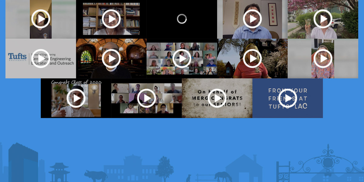
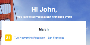
web email

My name is Andy Twomey. I'm a creative and fun UI / UX designer + front-end developer.

My experience includes:

General

  • UI / UX design
  • visual design
  • front-end development
  • accessible design and development practices
  • research, persona development, wireframing, and user testing
  • creating design systems and brand guidelines

Marketing

  • campaign site design
  • microsite / landing page design
  • email design and development
  • vendor management and review in the design/UX/accessibility space
  • design and development within Drupal, WordPress, Salesforce, Mailchimp, and Cvent

Online Learning

  • LMS component design and UX
  • custom built learning interactives
  • LMS course theming in edX, Moodle, and Canvas
  • designing with Articulate Storyline and web-based tools like Canva and Datawrapper

Examples of my work can be found below. Additional examples are available upon request.

Looking for a
Resume?

web applications

Donor Reports

Problem: 
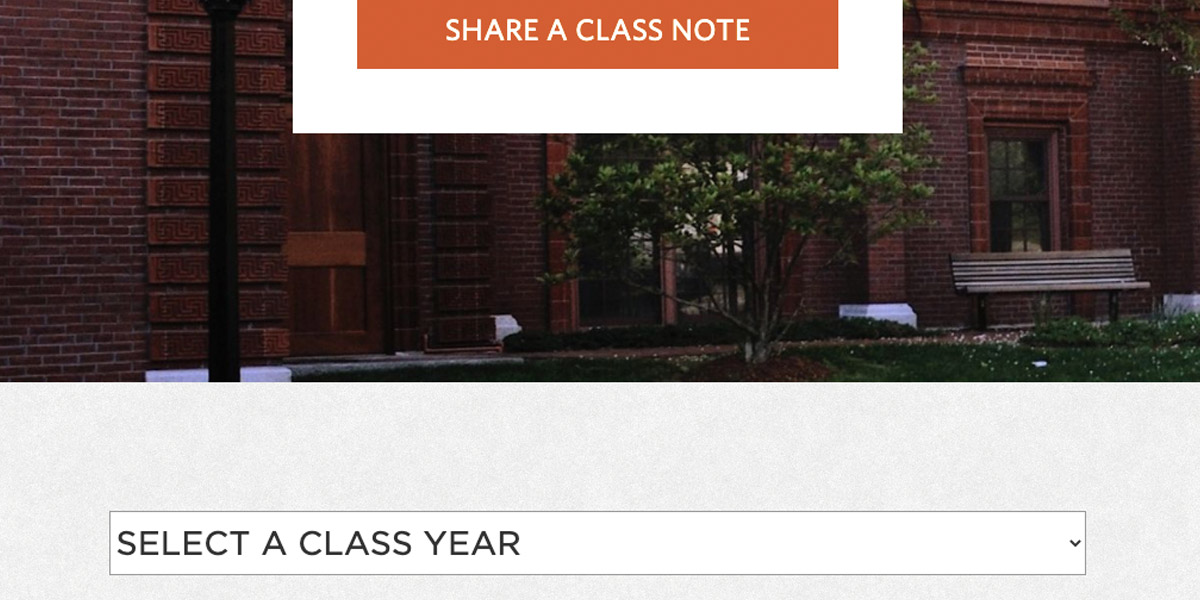
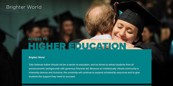
Existing donor reports were placed into a simple template on school sites using the Drupal CMS. One stakeholder wanted something more, and asked if I could separate text in the template of one particular report.

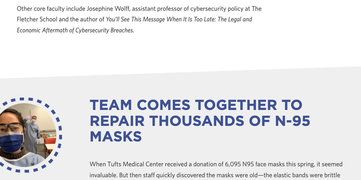
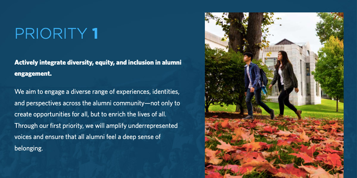
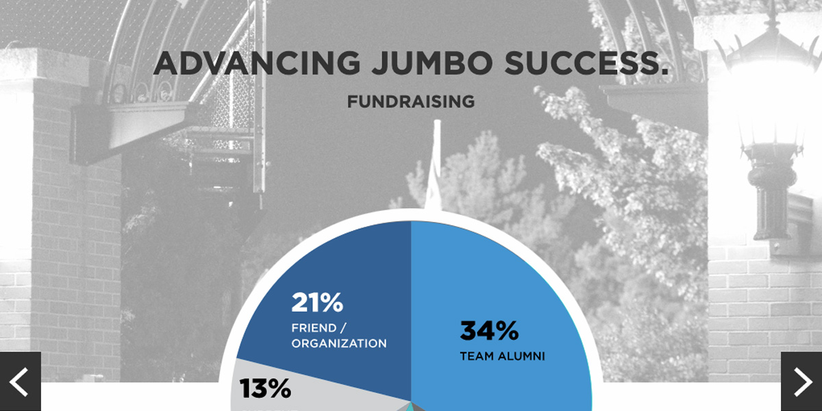
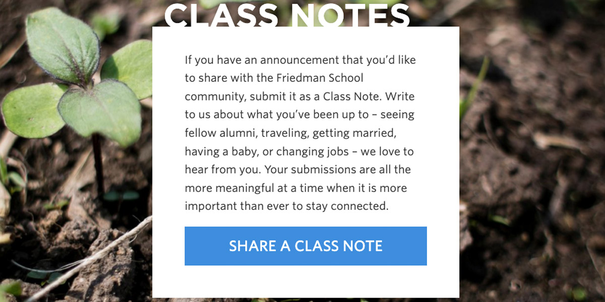
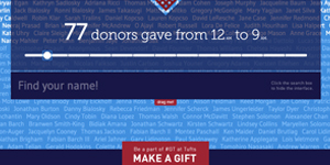
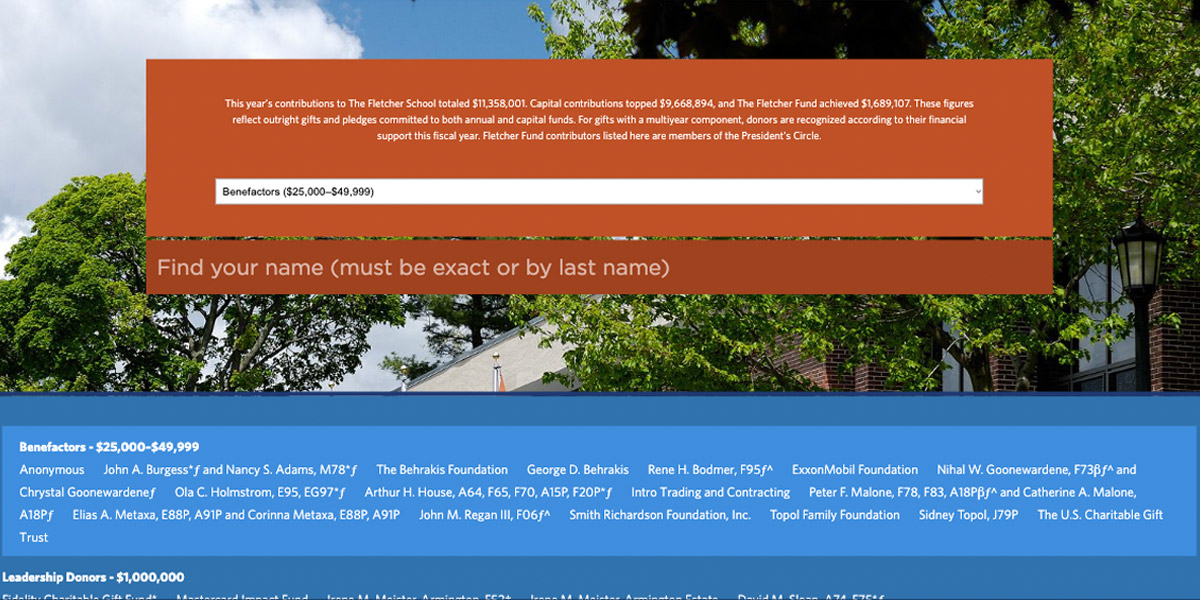
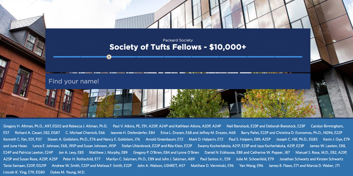
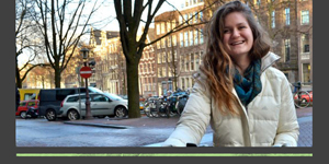
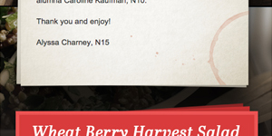
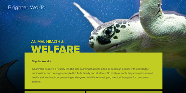
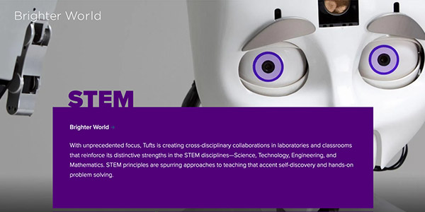
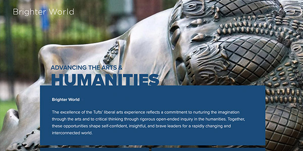
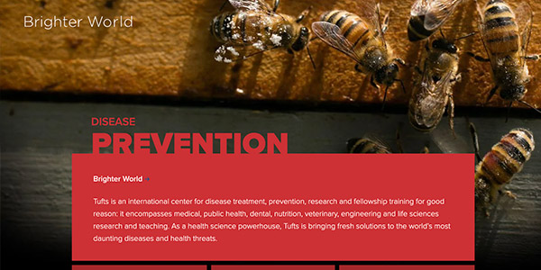
Approach: For the first report, I met with the stakeholder to understand how the content was developed and what the users took from it. I broke out the major sections of the content and turned them into reusable components loosely based on available print versions of the report, which at the time were the key component in the overall strategy. From there, I created components which could accommodate changes in the content. For example, the "profile tryptich" could show one or more featured headshots and personal interest stories—or variations thereof. Sections could be used multiple times in different ways throughout a report. After designing three reports, I provided content strategists with an ecosystem of components to help them visualize and plan mapping content to the report. We worked together on content strategy to identify moments where the experience would benefit from the creation of a new component.

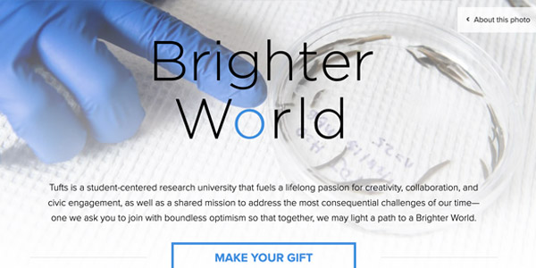
Solution: The redesigned report greatly increased the time users spent engaged with the content. Interactivty and strong design provided a sense that this was important information different from the rest of the school site, while the mobile experience was improved to the point where users were spending more time viewing the report in that format compared to desktop. The strength of the new online experience saw a large increase in the amount of click-throughs to adjacent content, such as longer articles and giving forms. Importantly, the content creators felt empowered now that they had the tools and methods to share their good ideas.

The success of the first report led to the stakeholder sharing it with her colleagues. From there, three others asked for similar reports, leading to the creation of a design ecosystem and an entirely different, second design to build reports alongside the first design. The online report was considered so successful that the university ended up saving money by retiring the print version in favor of the new online version.

Online Donor Reports have won CASE awards.

Contributions:

  • UX and UI design
  • front-end development
  • strategy

wireframe example

Tufts University: Fletcher Donor Report 2020
Tufts University: AE Report
Tufts University: Athletics Report 2020
Tufts University: Beacon Summer Report

Class Notes

Problem: Stakeholders wanted to transition the class notes feature of the magazine to a digital format to boost a limited response rate.

Approach: I performed user research to understand readers of the magazine. This quickly revealed limitations that hindered users, such as an inability to easily search through notes submitted over any length of time. After wireframing and designing a concept, the first stand-alone application for Class Notes was developed.

Solution: I created an engaging experience that allows the user to quickly sort through various class years and easily submit notes of their own. The success of Class Notes has helped the university phase out the feature in the print magazine in favor of a more engaging digital experience.

Success with the initial application led to the Fletcher School adopting the same format for their much larger audience and existing class note compilation.

Contributions:

  • UX and UI design
  • front-end development

wireframe example

Tufts University: Friedman Class Notes
Tufts University: Fletcher Class Notes

Donor Walls

Problem: To recognize donors during Giving Tuesday, Tufts University needed a way to quickly place names online at the start of each hour throughout a single day.

Approach: When asked to place names into a table on an existing site, I proposed expanding the project into an interactive micro-site. To illustrate the concept, I created a series of wireframes before moving on to design and development.

Solution: I strategized with the team and created an engaging interactive design that donors and users spent considerable time with.

Later, the success of the Giving Tuesday project lead to reviving the idea for other giving-focused campaigns and donor recognition initiatives. Eight spin-offs have come to life, leading to the creation of new components and capabilities like progress meters, different segmentation strategies, and more recently, a backend user interface that allows non-technical staff to update the information being displayed.

The work the team did on the Giving Tuesday, including the first donor wall, won a Tufts Distinction Award for the innovative concept.

Contributions:

  • Initial concept
  • UX and UI design
  • front-end development

wireframe example

Giving Tuesday
Fletcher Donor Wall
March to the Top 2017
Engineering Donor Wall

Virtual Commencement

Problem: With COVID-19 preventing large gatherings, a decision was made to hold a virtual commencement ceremony. As part of this, Tufts University needed to celebrate the accomplishment of graduates in a powerful way that could be understood quickly and easily.

Approach: I pitched the idea of recognizing the accomplishment of graduates by sharing well-wishes through videos embedded on a video wall microsite, filterable by school. While we expected 100 videos, we ended up with over 1500 submissions.

Solution: With so many videos, the page would have been impossible to load (100 was already pushing it). I created a solution where a screenshot of the video was created and placed on the page instead of the video itself—when the user clicks the thumbnail, it swaps the thumbnail out and loads the correct video through an iframe.

The video wall was well-recieved and created a memorable moment for graduates having to cope with such a mile such being restricted by the pandemic.

Contributions:

  • UX and UI design
  • front-end development
  • strategy

Tufts University: Commencement 2020 video wall

Email marketing

design and development

At Tufts, I acted as the primary email designer and developer, and later managed the email marketing team. From a design point of view, each email potentially offers a way to experiment with different creative approaches over a short period of time. Coding for email poses a unique challenge in that it needs to render perfectly on many platforms and devices, yet the support for web standards in this space is limited. I work around these limitations to keep designs and the user experience exactly as intended on any device.

More recent emails are created as templates using blocks in SFMC or Mailchimp to allow producers to easily make edits without seeing code. Coupled with great copy and well-formed marketing strategy that takes advantage of variable data and user journeys, these email designs have have increased engagement and revenue generation.

Campaign Site

Problem: This website is the face of a $1.5 billion dollar campaign. Originally, the design and development for the site was part of a larger project to combine two large sites into one. Halfway through the process, however, the vendor we chose was having difficulty and it was decided that the design would be done in-house.

Approach: Working with our digital, marketing, and creative teams, I designed series of wireframes and comps incorporating features we needed that weren't easily accomodated by the vendor's template. One challenge here is that is site needed to stand on it's own as a unique experience, yet still be closely associated with a larger Alumni site.

Solution: The design took advantage of block grids in a way that let us create visually interesting collections of related topics. Heavy on white space, powerful photos, use of many brand accent colors tied the experience together. The navigation and layout of the deepest pages of the site shared a layout with the Alumni site, cementing the relationship between the two.

Contributions:

  • UX and UI design
  • strategy

Explore the Project

Tufts University: Brighter World